Getting fishermen the right rules, at the right time, even offline
New Zealand's recreational fishermen need to know the rules before they cast a line, and the MPI app helps them do just that.
At their fingertips, they can identify fish and learn regional fishing rules from anywhere, even out at sea. This helps preserve aquatic environments, allows fish populations to thrive, and keeps fishermen safe from legal consequences.
I joined the project two months before launch to cover PK's lead designer and worked closely with the team to get the app over the finish line.

Project Overview
1 PM, 5 developers & myself
2 months from me joining to app launch
20+
QA issues caught before launch
Speed was key
App launched on time with quick turnaround
Background
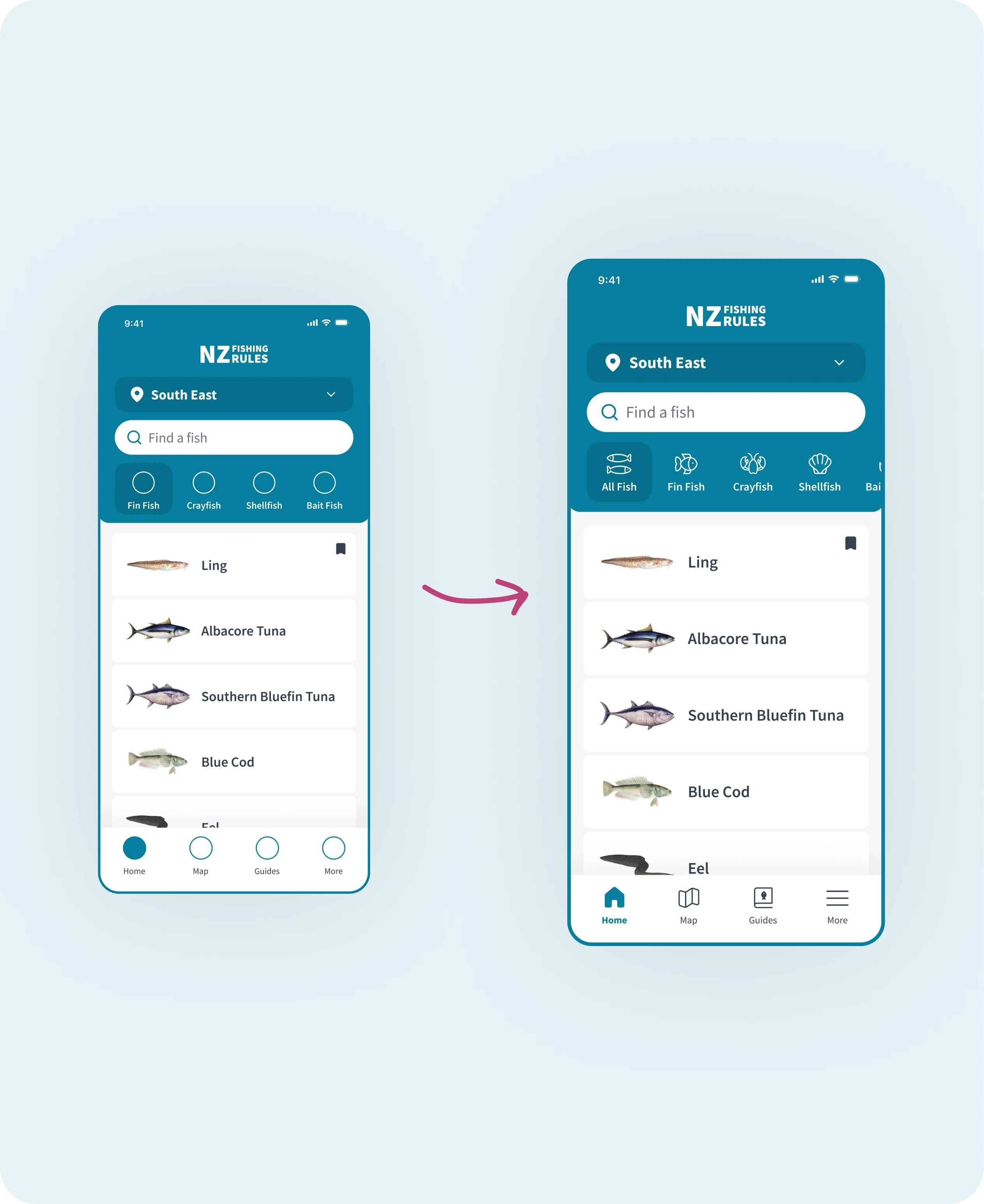
1. Onboarding
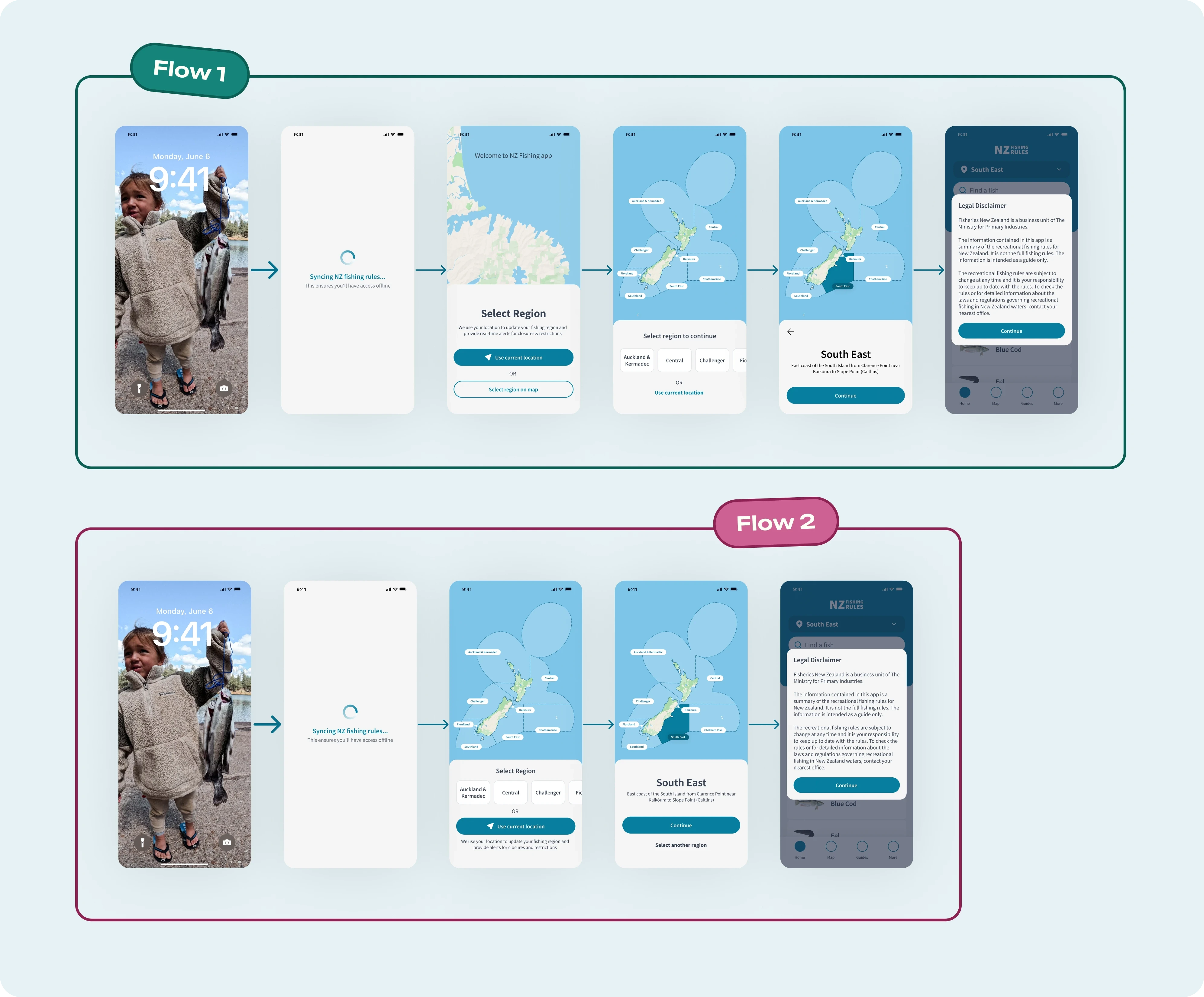
The original flow had a critical gap. If a user accidentally selected the wrong region, there was no way to correct it without closing the app and starting over, or changing it after onboarding.
For a first-time user, that's a frustrating way to begin, and it was easily avoidable.
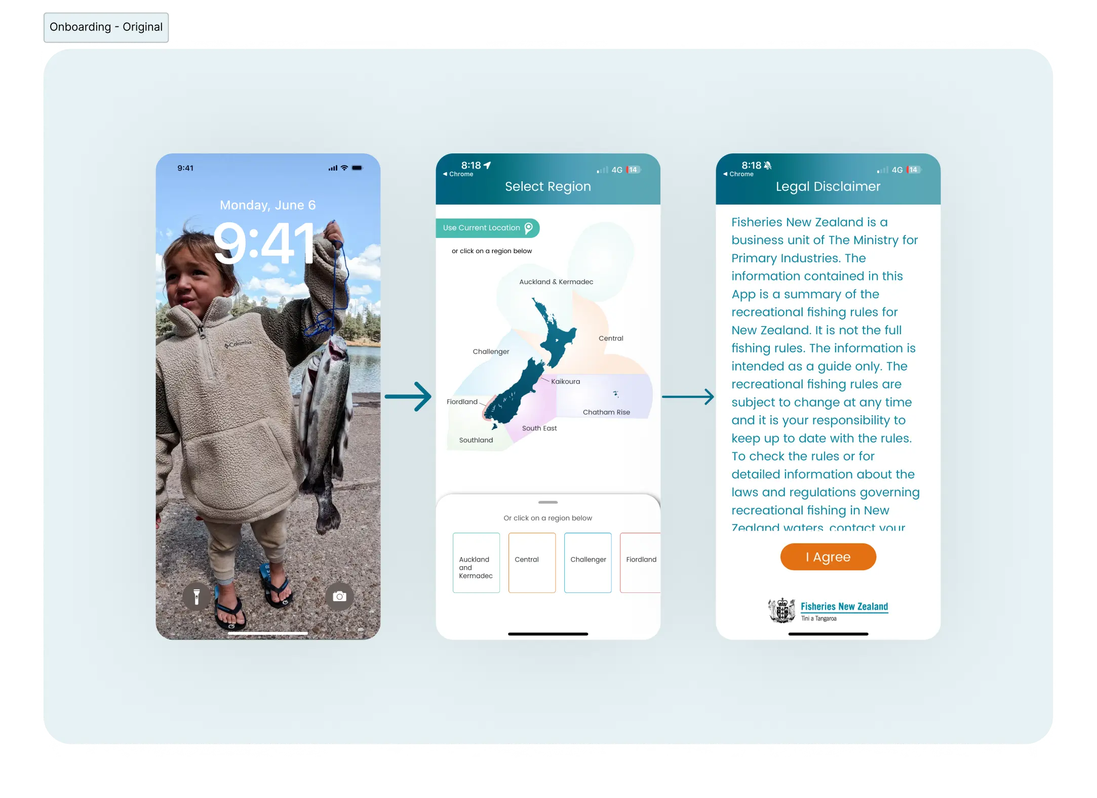
I talked through two options with the devs. The first introduced the map with a bit more context upfront, letting users skip it entirely by choosing their current location. Good, but not lean enough given the timeline. The solution we went with was a switchable overlay, which kept it to one screen without losing any functionality.
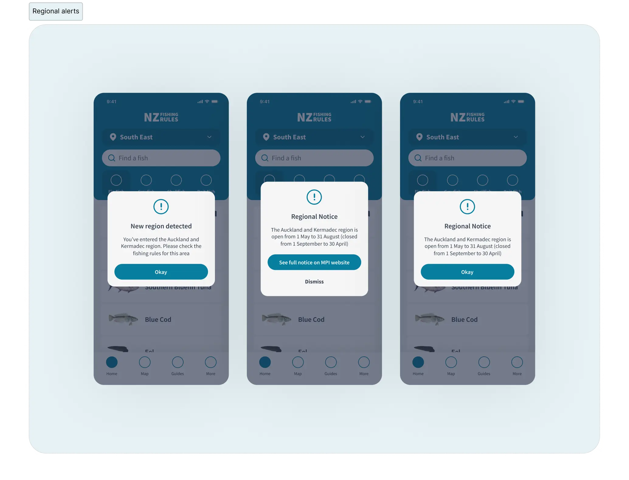
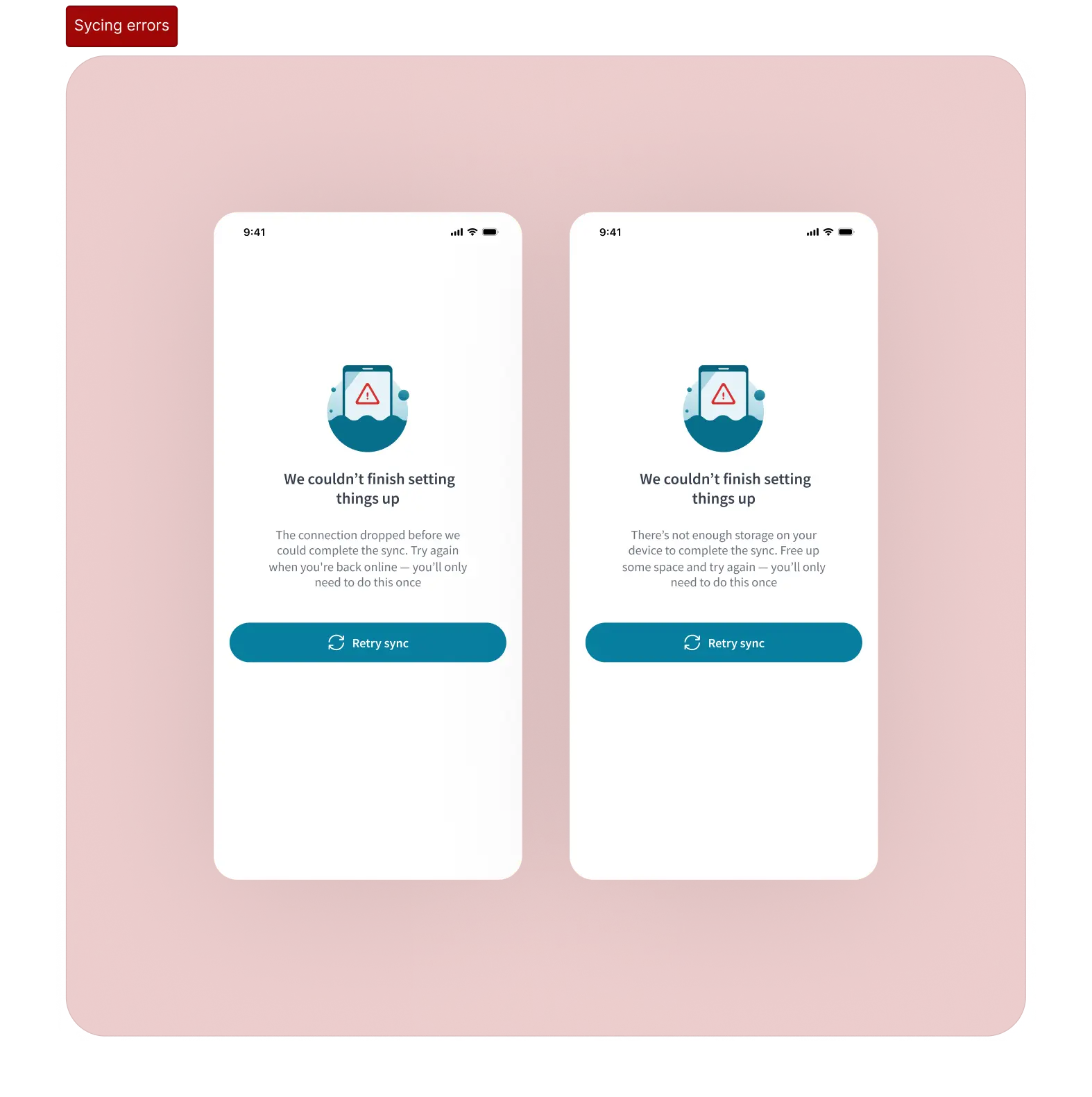
2. Alerts and error states
Fishermen's time is often spent out at sea. Because of this, app data needs syncing on first launch.
I also designed the regional alerts. One alert if GPS detects a location outside their selected region, and an alert for closures and restrictions. I designed reusable screens, so devs could implement them quickly.
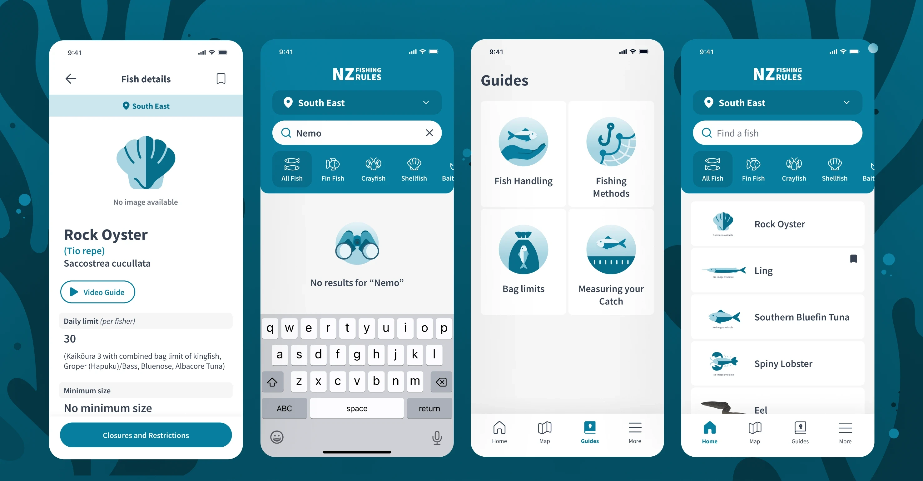
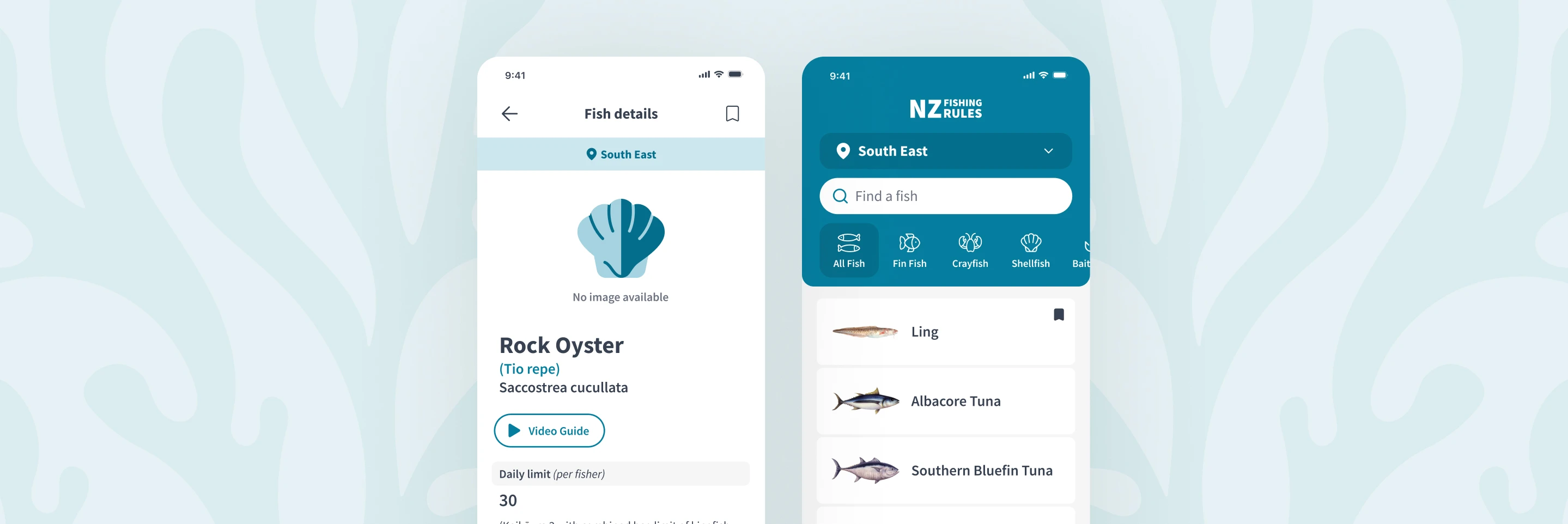
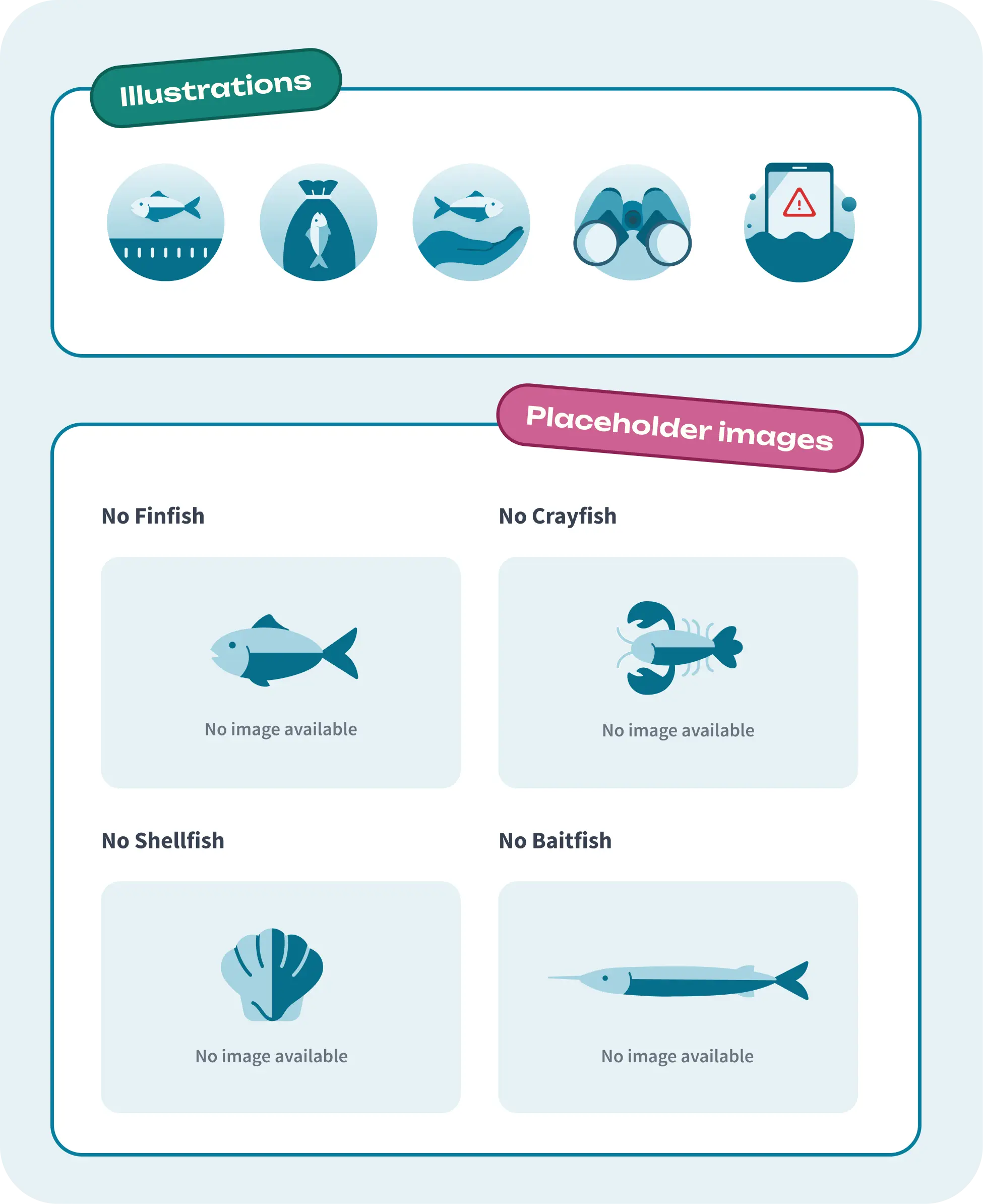
3. Icons and illustrations
The NZ Government Fisheries guidelines defined colour, type, and imagery at a broad level. Icons and illustrations hadn't been defined, so I used existing MPI assets as a reference point and pushed them to feel more fun and modern.
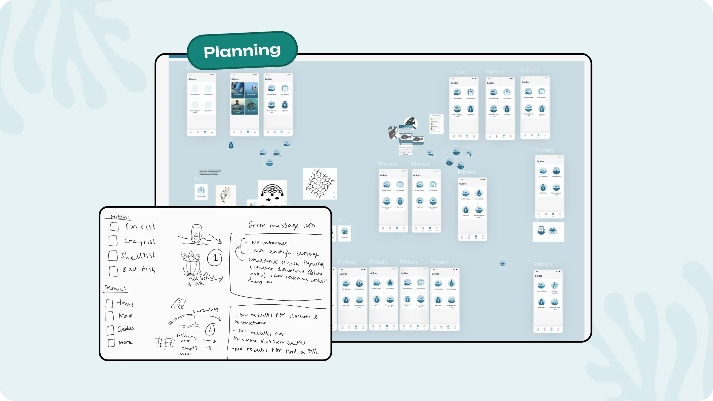
At 32x32px, every line counts. Making them cohesive and simple was the priority, and all icons had to be immediately recognisable at that size. The crayfish filter was by far the hardest! I made it work by slowly eliminating lines until it perfectly balanced the other icons.
Illustrations are used throughout the app, so they all had to feel cohesive. I created them for the fishing guide section, no search results, error states and "no fish" placeholder images.
4. WYSIWYG editor (Style guide)
All the screens within the menu and guides needed to have the same CMS styling to keep the screens consistent. I created a WYSIWYG editor (Style guide) for the team to follow.
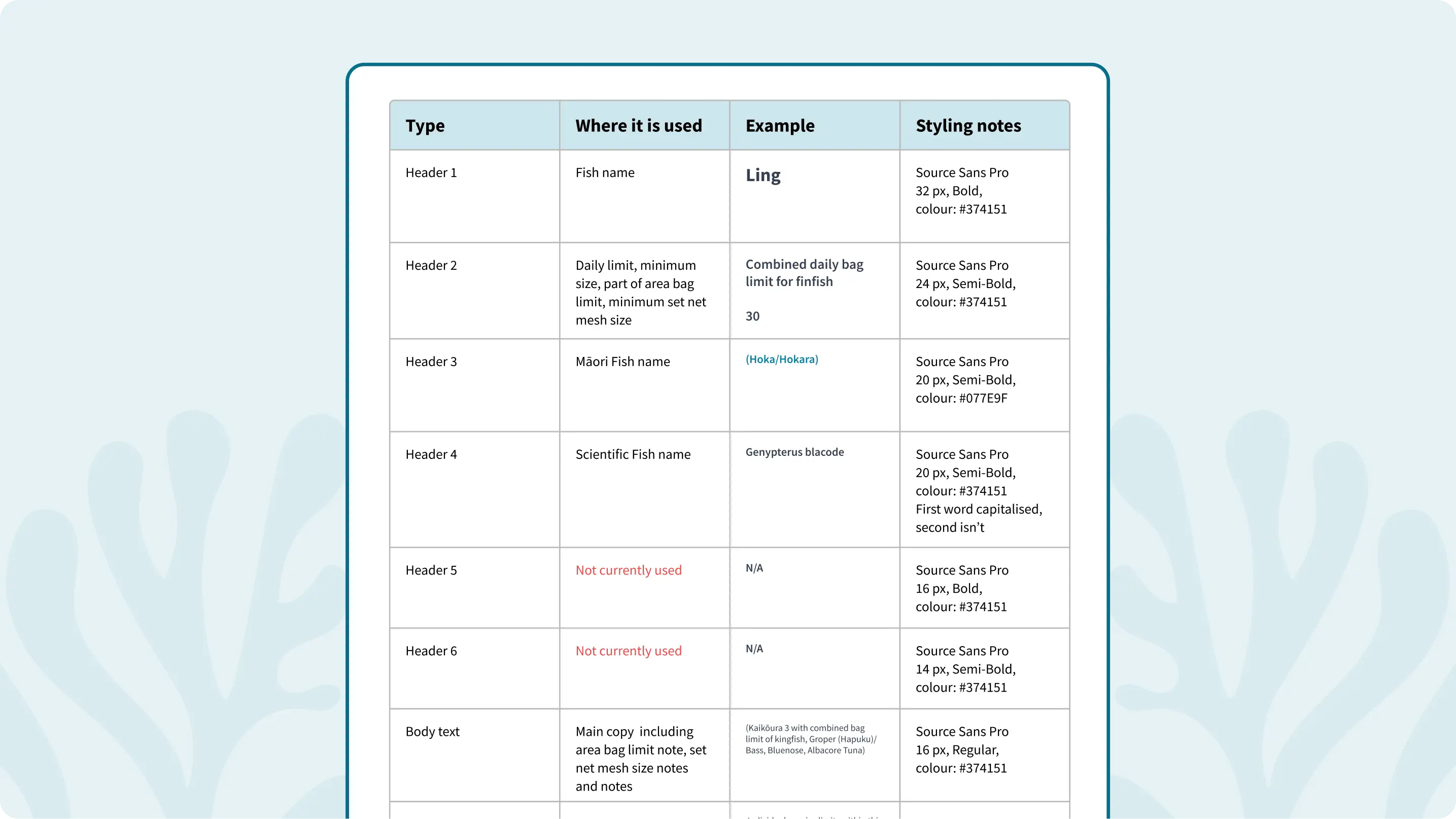
WYSIWYG editor (Style guide)
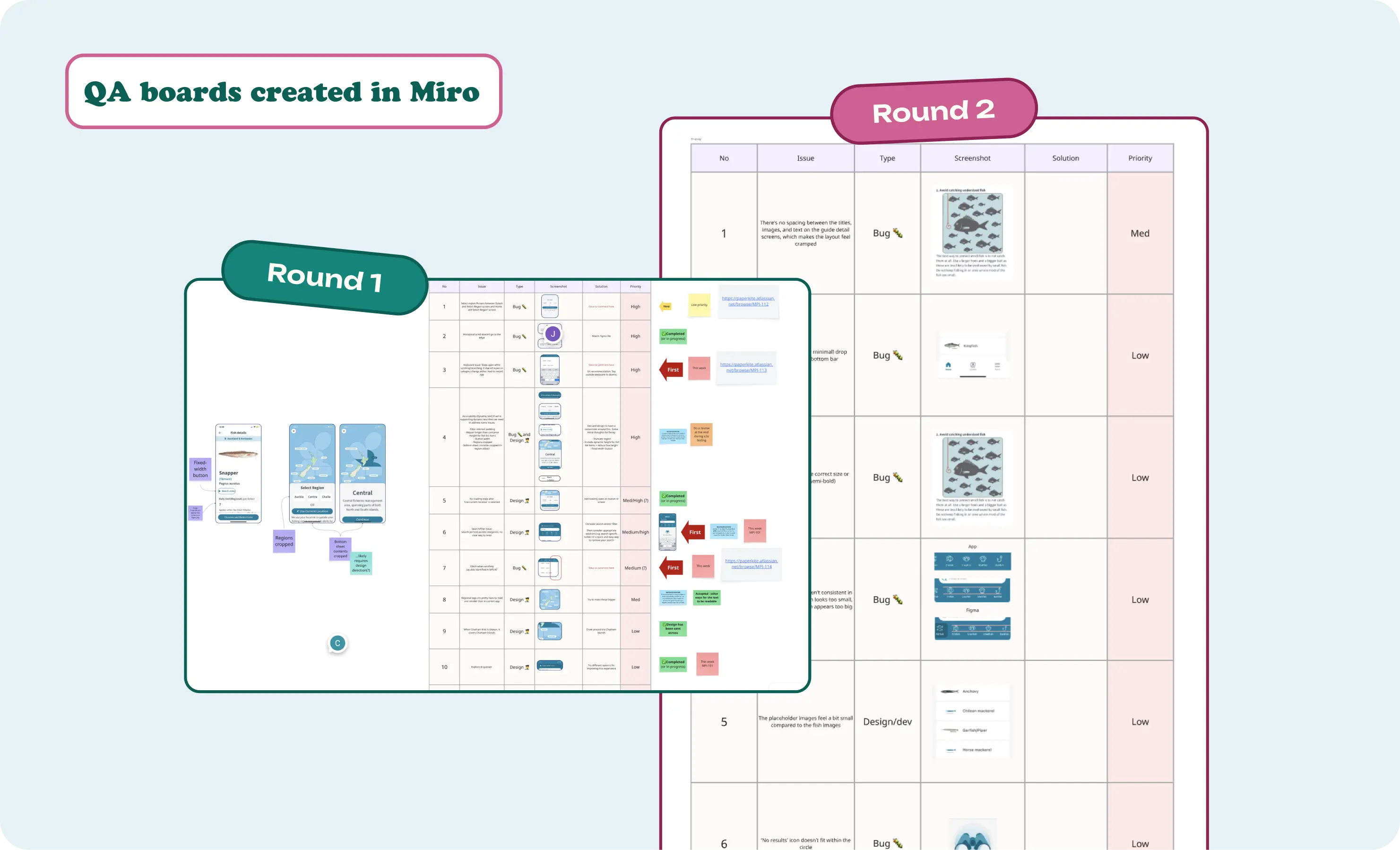
5. Accessibility and QA
Outcome
What a joy to work on such an impactful project with an amazing team! Big shout out to Cole, PaperKite's designer, for making my life easy with a great foundation, Steph for getting me up to speed so quickly, and the devs for bringing it all to life.